Thursday, March 31, 2016

Off To A Conference

[Trillium blooming next to my favorite drinking spring]

I have a new habit that I'd kind of like to cultivate, telling y'all when I'm going to take a break from blogging.

This isn't going to be a big pause, but I am traveling to the SGCI conference in Portland until Sunday. I can't wait to go and meet folks who know way more than I do about this art form and its place in the world. I'm sure there will be a lot to write about next week.

The lunar calendar fundraiser is on hold for a few more days because I forgot to put a drying agent in my ink. The prints should be ready to sign and package up when I return from the conference. I won't make that mistake again!

Tuesday, March 29, 2016

Soapstone Green

On my first day back from the coast, I just had to try one of the new pigments. I chose the most unusual and unpredictable first, soapstone. It is already partially ground up so I think I'll be able to just water sort some light particles from the mass without a lot of grinding at this point.

[Chunks of stone with crumbled bits]

The stuff acted weird! All of the particles fell out of suspension very quickly, which would normally indicate that they are large. In this case they're not so I just went ahead with the process.

[Finest particles from water sorting]

There was a lot of slop left over, though. If this test works, I'll go ahead and grind this down to make more one particles.

[Leftovers from water sorting]

At the end of the day I really wanted to feel the grit of these particles under the muller. Even though they seemed large, they felt fine to my hand. Tomorrow will be the real test when I add this powder to an ink base and test it on paper.

[Smeared on the mulling slab still wet]

At this point I got on the internet to see what I could find out about soapstone. It's talc, which explains the extreme softness and strange slipperiness. I also learned that it's used in the recycling process to release ink particles from paper pulp. This might be a bad behavior if my goal is to get them to stick to the paper surface. I'll try it and see!

Monday, March 28, 2016

Pigment Trip

This weekend I travelled to the Oregon coast, near Brookings. The sights are spectacular, and so are the mineral deposits!


[Looking north from Cape Sebastian]


[Cape Sebastian]

As I explored the beaches and hiking trails, I almost immediately found what I was looking for - stones that can be ground up for pigments. On the beach I found one piece of a stone that I know very well from my time in San Francisco. It's a step in the process of creating serpentine. At this stage, it's a soft soapstone. There are some places where this is the hardest material in hillsides made of blue clay. They're all just stages in the process - clay turns to soapstone which turns to serpentine which, I hear, eventually turns into jade. Finding one of these stones perked up my senses to see if I could spot the area where it this beautiful blue-green came from.


[One chunk of serpentine soapstone on the beach]

Well, I didn't have to look far. Here's a photo of a hillside right next to the road, just a minute's drive from that beach. Yes, that's a reflection of the car dash in the sky. And yes, the hillside really was just that blue.

[Myers Flat serpentine clay deposit]

When I stopped to scoop up some of that amazing clay, I took a little two-hour jaunt down the beach and found a whole hillside that was made of iron-rich sediment layers. These were tumbling down to the beach, yielding all different colors of ochre.

[Myers Flat hillside shot through with ochre]

Here's a creek I had to wade across as I walked down the beach. Look at those colors!

[Creek with jaspers, serpentines, and ochres]

There's another stone that caught my attention. We have slate in my part of the state, but it's a darker black and much more difficult to powder. This stone looks like it will yield a rich grey and take no time at all to powder.

[Slate is powdering itself]

There were other deposits that simply taunted me. Here is the most vibrant orange I've ever seen come from the ground. And it was ready-to-use, being a clay instead of a stone.

[Orange clay]

But, alas, there was only one tiny piece of it in an otherwise brown landscape. Can't win them all, eh? Maybe one day I'll find a place where this gorgeous color is the predominant feature.

[One speck of orange in a field of brown]

Next, I'll have to start labelling and storing these stones so that I can remember where the colors came from when I use them in my art. Then, it's time to powder a few of them up and see what I get. I can't wait to see how that blue-green works in an ink!

Sunday, March 27, 2016

Lunar Calendar Printing

Just like I expected, last night didn't include much sleep. I woke up early, excited to tackle the huge batch of printing today.

Before I could do anything, though, I had to take time to carefully tear the large sheets of paper down to size. Contrary to standard practice, I decided to just tear down half of it at once.


[Tear bar and paper]


[Half of today's paper]

It's exciting and daunting to see this much raw material waiting for me to do something. Once the paper was ready, it was time to unwrap the ink that I had prepared yesterday. That blob is way bigger than it looks in a photo. It probably weighs 3-4 ounces. Thankfully, the consistency was just the same today as it was last night so I didn't have to spend time modifying it again.


[Ink is patiently waiting]

Here's a quick snapshot of my workspace at some point in the middle of the day.


[Tidy and compact setup]

It was a long and difficult day that ended when the ink ran out. I expected to pull 60 prints so that I could choose the 50 best ones for my edition. The ink ran out after 49 prints. I was so tired at the end of the day that I couldn't even think about choosing prints that are good enough for the edition. I'll sort them after they've had a few days to dry.


[Stack of prints]

I did, however, take a certain amount of pleasure in bringing some finality to the process. It's traditional to destroy the matrix after a limited edition is pulled, making it impossible to print more.


[Matrix is destroyed]

It is finished!

Next week I'll sign, number, and wrap these prints so that they're ready for the folks who are supporting this fundraiser. If you'd like one you can email me, contact me through any of my social media accounts, or see me in person.

Saturday, March 26, 2016

Lunar Calendar Setup

Having never done a big print run, I really thought I'd get it all done in one day. Ha! Here's how far I got on the first day...

Before I could print I needed to make a jig to register my block in the center of each sheet of paper. Thankfully, I have a wood shop with scraps from making plates. All I needed to do was glue some scraps together and tape two guide strips on top.


[Roughen before applying glue]


[Clamped flat and square]


[Raised paper guide]

Next I set the pressure on the press. You do this by running dry paper through it and testing how much and how evenly it embosses. These are strips left over from tearing down the paper that I'm using for this edition.


[Pressure test]


[Inkless embossing]

When the embossing was deep enough and the same on both edges of the plate I knew that it was set tight enough. Then I had to mix up more ink than I've ever mixed before. I just have to guess how much I'll need and try to make a little extra.

This part was very hard, again, because I'm using a runnier ink than the woodblock calls for so I need to thoroughly mix in a stiffening agent. It was like folding powdered sugar into taffy, at least an hour of pulling and spreading, testing the length, adding powder, pulling and spreading some more.


[Modifying ink]

Finally, the ink was done. I was able to pull a few proofs and hone my inking method.

If you look at how big that printing block is compared to the size of the press, you'll see that this is the absolute limit of what I can print with the Richeson Baby Press. These calendars only have a 1" border in order to maximize the size of the print area.


[Block and jig for an artist's proof]

At the end of the day I realized that I could never print the whole edition with the time that was left so I put a sheet of heavy duty plastic over the ink and went for another hike in the mountains. A few hours of fresh air and sunshine will be a lovely memory tomorrow when I'm at the press before the sun comes up.


[Ink sealed to the slab]

I'm terrified and excited to pull this edition tomorrow, but there's no way to learn than to just do it. I know I'll make mistakes and that I'll learn from them. I don't think I'll sleep much tonight!

Friday, March 25, 2016

Drying Rack

I love it when a plan comes together!

A while back I ordered this print drying rack. It was quite affordable, but required me to wait a while for delivery and spend a few hours assembling it.


[Print rack during assembly]

It could not have arrived at a better time. Tomorrow I'll begin printing the edition of lunar calendars. Yes, I *could* have found some way to spread them around the studio and gotten them dry, but it really is much easier, safer for the prints, and more compact to use a tool that's designed for the purpose.


[Print rack, set up and installed]

The rack has 40 shelves which can each hold 2 prints at the size I'm using. That means I'll have room for 80 prints while only pulling 50. I might just leave every third shelf empty to increase airflow and be sure the prints are dry by the time I need to start filling orders, next week.

If you haven't ordered yours, I wouldn't wait. Over 20% of them are sold and I haven't even printed or promoted them yet. Just send me an email or leave a comment on this blog post and I'll set yours aside before I start the sale.

I'll tell more of the story soon, but the upcoming prints are not only a chance for me to prime and test the print studio workflow, they're also a fundraiser. I'll be using the money that I raise from this "ground floor" project to pay the transportation expenses to go and study a particular printmaking skill with a specialist teacher in Nebraska.

Thursday, March 24, 2016

Private Printmaking Lesson

This last weekend I took an intaglio class at the Whiteaker Printmaker's Studio. I sort of knew that intaglio was not for me even before I learned it, but you've gotta try it to know, right?

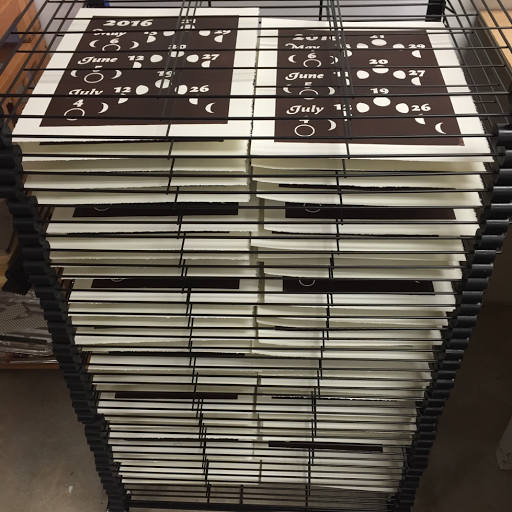
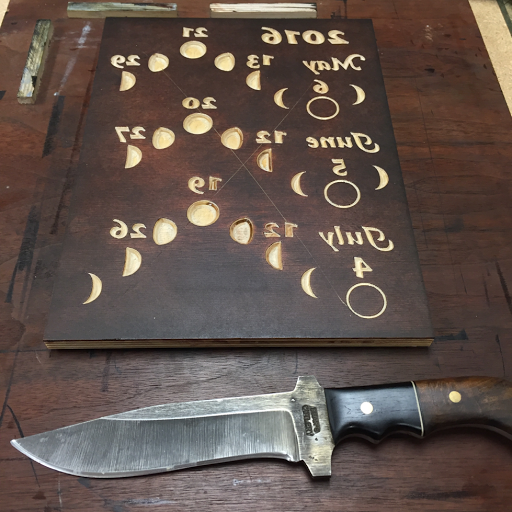
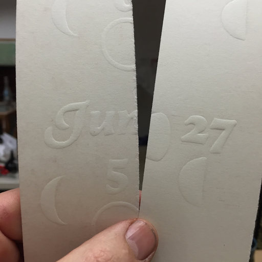
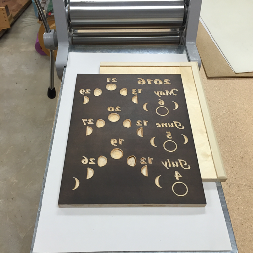
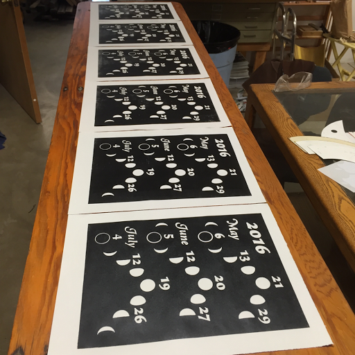
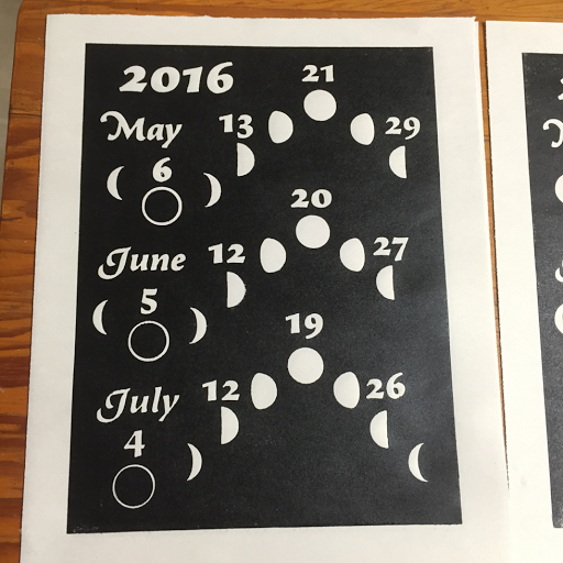
As long as I was paying for a trip to Eugene, I decided to make it even more worthwhile by scheduling a private lesson with Heather, one of the founders of the studio. I wanted to walk through all of the skills and techniques that I'd need to use in pulling my first edition, the lunar calendars I'm printing to help pay for a big trip to study with a specialist teacher. (I'll talk more about that when I know more.)

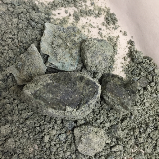
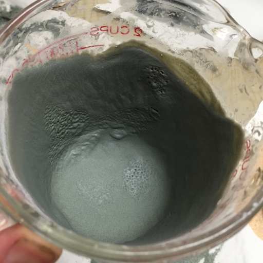
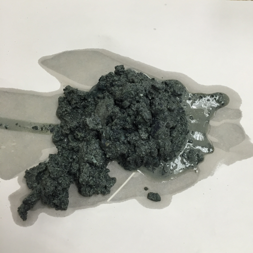
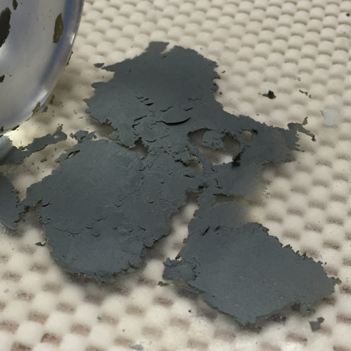
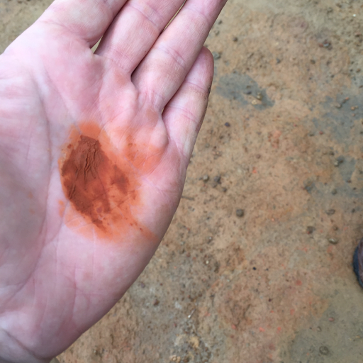
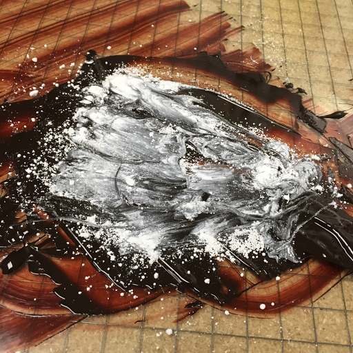
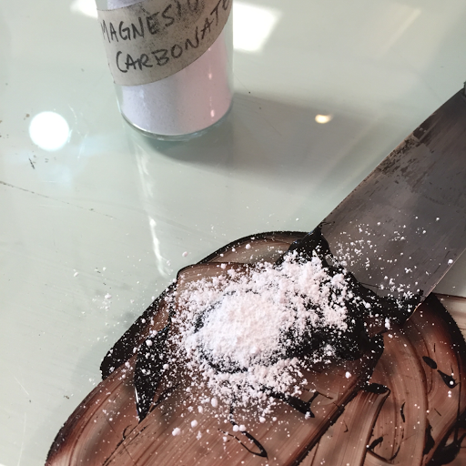
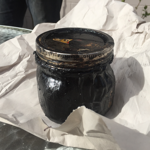
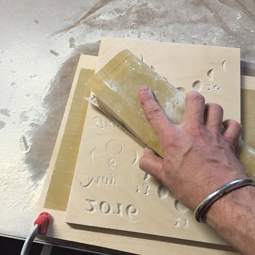
We walked through the specifics of tearing down paper for an edition, and then went right to the ink. I threw a curveball by wanting to use the wrong type of ink. That this is the wrong type of ink was news to me, and shows just why I needed this lesson. Since my ink was way too runny and "long", Heather walked me through modifying it with magnesium carbonate, teaching me just how it should act when I'm drawing it out and pulling it up to check for length.


[Magnesium carbonate]

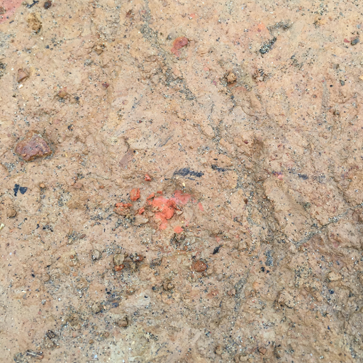
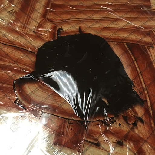
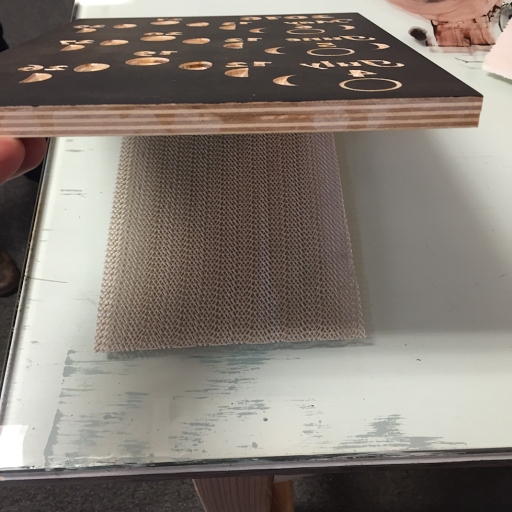
Once I got the ink to roll out correctly, it was time to ink the plate. I built a bench hook to use in my studio and have found it a little problematic. Heather suggested a nonslip mat so that I can roll in all directions. It's perfect!


[Nonslip mat]

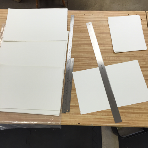
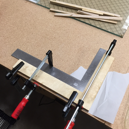
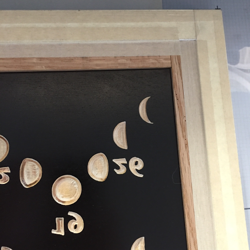
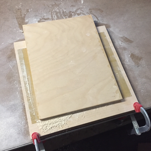
Then it came time for registration. The studio has a simple jig with a 7/8" border between the paper and the block. It's not perfect. My edition will have a 1" border so I'll need to build my own jig, but it worked well enough to teach me how to use it. The block snugs into the corner. The paper snugs into the upper corner formed by the matte board, being careful to keep it off the plate until it's in position. Then, I drop the paper onto the plate and use one hand to hold it while the other hand removes the jig and puts the blankets down. It's simple and very accurate!


[Registration jig]

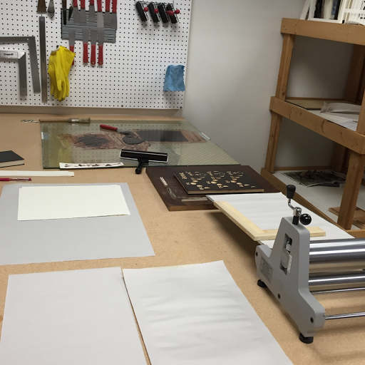
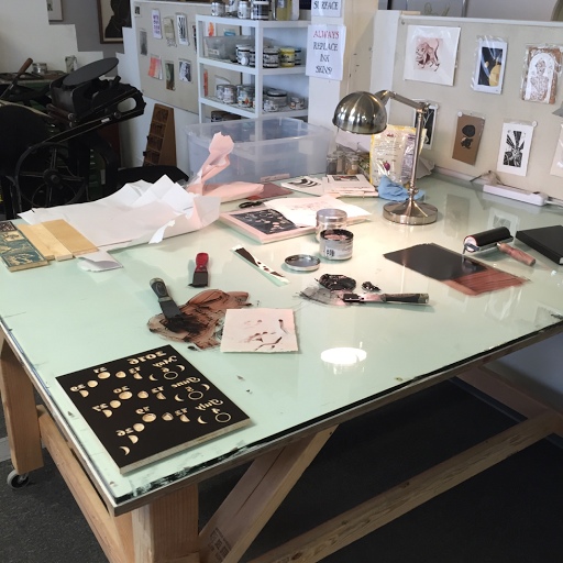
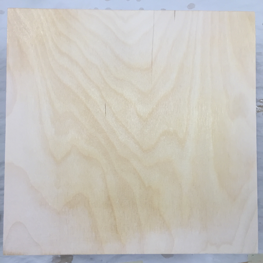
Here's a snapshot of the beautiful glass-topped work table at the studio. It's an ideal work surface.


[Work space]

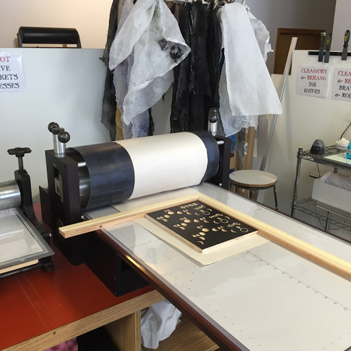
For today's work, we were using the Ettan etching press. Again, it's just a beautiful piece of equipment. So smooth, accurate, and easy to control.


[Jig on press for paper registration]

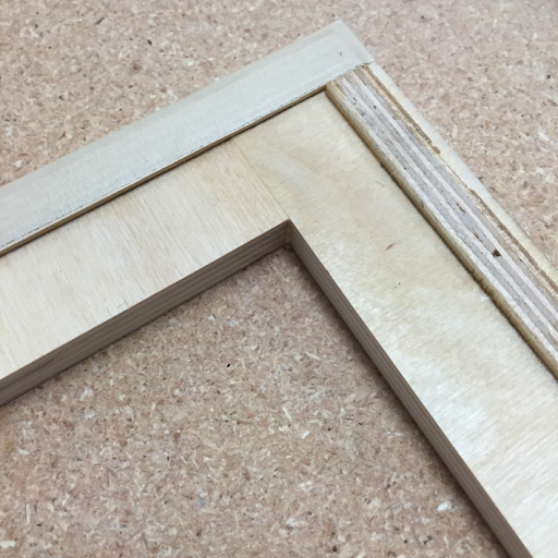
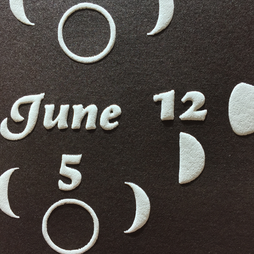
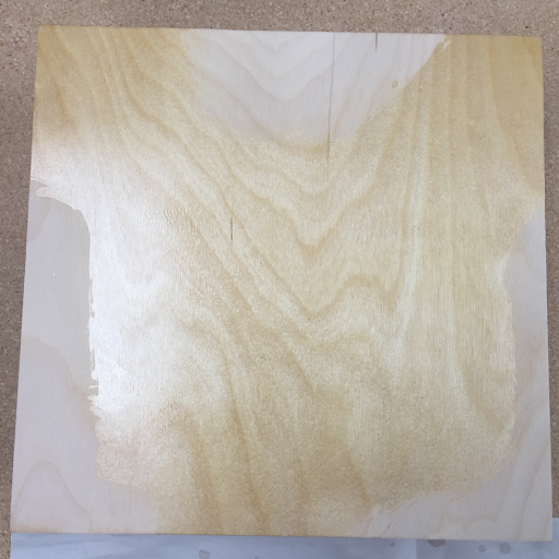
We pulled four prints, adjusting the inking, the blankets and the pressure until I got just the effect that I was going for. Since this project uses only one block with bold graphics, I decided that I want a little embossing even though it isn't traditional for woodblock prints. Just as we pulled the last test the sun came out, allowing me to take this dramatic photo of the gorgeous chocolate-colored ink and the delicate embossing.


[Raking sunlight on an embossed print]

After this, she talked me through it as I reset the press and cleaned everything to her specifications. Everyone who uses the space seems to be extremely considerate of the others. Printmaking is messy business, but when folks are done, they reset the space to such an immaculate state you'd almost never know what kinds of messes have been made there.

Heather was a patient and amazing teacher, making sure that I not only understood how to do things, but exactly why I needed to do them. As I suspected, there were big pieces of the process that I had forgotten or never really learned when they were taught to me in the past. In just a few hours, Heather raised my skill and confidence level far enough that I'm going to go home and commit myself to pulling 50 prints of the largest plate that I've ever carved. My time with her was so precious that I didn't stop to take notes during our session, but I did spend over an hour writing everything down afterward. I really want to remember the awesome skills that she shared.

If you're in the Eugene area and could use access to a fantastic printmaking facility or a refresher on printmaking skills, give the Whiteaker Printmakers a try! I think they're still accepting new members.

Wednesday, March 23, 2016

Weekend Etching Class

I'm a little behind on blog posting because I'm too busy actually doing stuff. C'est la vie!

This last weekend I took another awesome class at the Whiteaker Printmaker's Studio in Eugene. It was taught by Bryan Putnam, an amazing printmaker who uses a variety of advanced techniques in his print work. This class focused on intaglio, covering four major topics in two days.

On the first day we learned about etching, starting at the very beginning with "hard ground", a combination of alsphaltum, mineral spirits, and some other stuff. It smells so strong that we can only use it outside.

[Asphaltum]

The image that I chose might look familiar. I'm calling it my "workshop subject", a photograph of a dead juniper from Teutonia Ridge on the edge of the Mojave in Southern California.

[Teutonia Ridge Photo]

The plate is taped down so that I can trace the outlines for my needle sketch.

[Inscribed plate, ready to etch]

Then the plate went into an acid batch to etch in the lines that I had scratched through the ground.

[Etched plate, cleaned of asphaltum]

After cleaning off the ground, it's a "simple" matter of rubbing ink into the etching and wiping it off of the plate without wiping it out of the etched lines. The paper is moistened and run through the press to squeeze it into the lines and pull out the trapped ink to create the finished etching.

[First print]

It's not too shabby for my first print. Yeah, it looks like a first-year art student outlined pencil sketch, but we really did only have an hour or so to do the sketching in between learning all of the other process steps and actually doing it.

On the second day we covered aquatint: rosin and spray paint ground, stage etching (painting certain areas with ground to stop the etching in between repeated acid soaks), spit bite (painting with acid), sugar lift (painting with sugar to lift the ground and allow access to the acid bath in specific areas). It was so much to learn and at such a rapid pace that I didn't take any photos.

In the end, I learned one big thing this weekend. I am a relief printer. The class was amazing and Bryan was a fantastic teacher, but the techniques that we learned are just not a good fit for my artistic style or my lifestyle. Remember that whatever I do I want to do in a yurt on a hillside with no electricity or water.

  • I don't want to waste ink by wiping it off on tarlatans.
  • I don't want to get my hands as dirty as plate wiping requires.
  • I want to print way faster than intaglio allows.
  • I don't want a vat of acid in my studio.
  • I don't want to haul in the amount of water that's required.
  • I don't want to wash acid, even in small quantities, onto my land.
I think of it like this... As I explore the techniques of printmaking, I've got a huge tree of possible techniques and styles to choose from. If I'm going to get anywhere, I need to make some decisions on how to focus my attention. This weekend pruned a major trunk off of the tree in one fell swoop! I will not be even slightly tempted to incorporate the wide world of intaglio into my process at this point. Trying intaglio really has directed my focus very clearly on woodblock printing. The ability to focus my attention in this way is very well worth the time and money that I invested on this class.

And, as you'll read tomorrow, I learned volumes about woodblock printing in a private lesson on the Monday after the class.

Thursday, March 17, 2016

Lunar Calendar, Take 2

In yesterday's version of the calendar I had one big problem, it was off-level. The top edge was thicker than the bottom. Today I tried a few things to fix it. First, I started sanding with 220 grit paper glued down to a flat board. I move the plate instead of the paper, applying pressure as evenly as I can.

[Sandpaper glued to a board]

Even still, you can see from the uneven sanding that the surface is irregular. The lighter patches on the edges are contacting the sandpaper. The darker section in the center is not.

[Uneven sanding]

To fix this, I'm trying something new. I'm applying one coat of shellac to the low areas in an attempt to raise them up a little. I didn't document it, but I think it worked.

[Uneven shellacking]

After the carver has done its work, the "perfect level" of the board doesn't matter. (The press can handle a little inconsistency, I think.) I noticed that it was slightly off level, so I'm using a long homemade wood block to sand down the high spots without messing up the level too much.

[Sanding down the high spots]

I pulled a few proofs and I'm not satisfied. Yes, it's better than yesterday, but if I'm committing hundreds of dollars of paper and renting studio time with an instructor to help pull this edition, I am going to spend the extra time to make sure the plate is as perfect as possible.

[Proofs on newsprint]

Here's the best proof from the run. Notice the relative type weight. Again, "May" is quite a bit heavier than "July". In the future, I will not use much type or I'll employ some other trick to mask the fact that it's really tough to get my plates within the 0.001" tolerance that's required for perfect type.


[A/P v3.1]

Wednesday, March 16, 2016

Lunar Calendar, Take 1

Yesterday I received confirmation that Heather, one of the owners of the Whiteaker Printmakers studio, will be available to help me print the edition of lunar calendars on Monday after the intaglio class. This is great news, and really lights a fire under me to nail the carving of this printing plate. I gave myself four days to get the kinks worked out, and I'm glad I did. It looks like I might need them all. Every plate requires about 7 hours of shellacking, drying and sanding before it's ready to print. I can't multitask them because the next plate needs to include the lessons learned from mistakes on the last one.

Yes, I've carved hundreds of wooden signs and dozens of printing plates with single-color images and, even, four-plate registered designs. The thing is, though, that I've never combined the two skill sets - large format carving and perfection-intensive designs. It turns out, not surprisingly, that preparing the birch for carving is extremely difficult. I'll cover some of the difficulties in the next few posts, but for now let me walk you through today's lesson...

The first thing I noticed is that carving text is going to be very tough. I am making this image large in the hopes that I'll be able to render a the text pretty well. It's not looking very good. The counter on the "e" in "June" broke off when carving. I'll try sanding the surface down a little to get a tiny dot there. If that doesn't work, that letter will look terrible.

[Ooops, the counter in the 'e' broke off during carving.]

Before I can print, though, it needs one more coat of shellac to protect the newly carved wood from absorbing ink. If it gets in the crevices, I need to be able to wipe it out.

[Shellac is drying]

Once that was dry, I was able to ink up and pull a proof.

[Inked for a proof]

[The proof]

Here's the final analysis: the plate was not flat and level enough. Text is a great choice to disclose every tiny imperfection. Notice how "May" looks bold while "July" looks semibold? Look at the counter in the 6 of "July 26" and then "May 6". The top of the plate was slightly taller, like 1/100th of an inch, making the carver cut a little deeper there. Since I'm using a V shaped bit, deeper means wider, which means bolder type.

I don't know why the plate is deeper at the top. Maybe there were shellac drops on the back of the plate. Maybe the wood is warped. Maybe it warped when I shellacked it. Maybe I sanded it unevenly. Maybe the bed of the carver is mounted very slightly off level. I've got three more days to explore each of these, and maybe more, so that I can bring a perfect plate to Eugene next weekend. "Art Under Pressure" indeed!