Thursday, December 31, 2015

Transparent Ink For Greater Tonal Gradation

One of my technical goals with the printmaking is to strategically use overlapping transparent inks to create a rich set of tones from a few plates. In this next exercise I'm cheating (or just making it easier on myself) by choosing a set of colors that will behave well even if they overlap in unintended places.

First, I did a digital simulation of how semi-transparent inks might react if they were printed over each other. The purple will go down first, covered by the creamy magenta, and finally, the pink.


[Ink layering simulation]

From this simulation I created a palette of five colors and used them to create an image.


[Image using those 5 tones]

Next, I broke the image down into separate plates, being careful to remember which plates contribute to which final tones. You'll notice in the ink simulation image above that the first and last inks contribute to two tones each while the second ink contributes to three. It's a little tricky, but I think I separated them right...


[Separate plates for separate inks]

Here are the blocks, all shellacked and ready for the final sanding and printing after they've dried overnight.


[The carved blocks]

Now all I have to do is mix up inks with the right amount of opaque coverage and the right colors to behave like the simulation. Transparent tint base and opaque white are my friends. Tomorrow is going to be fun!

Wednesday, December 30, 2015

Precision

As I dial in each part of the printmaking process, it reveals other parts that need work. Now that I've created a system for registering my blocks, I can see that the blocks themselves aren't always square. It's my own fault. To save on time, I used the table saw to cut them. For the next batch I'll try the radial arm saw which is a better tool for the job.

For now I'll just turn the blocks until I find a square corner and make sure that I carve it in that direction.


[Off square at this corner]


[Square corner]

While doing this, I realized that my old jig was set up to require blocks to have two square corners, one in the lower left and one in the lower right. For now, that's a lot to ask so I made a new jig with the square corner in the lower left, which is also the origin (0,0,0) in the computer model.


[New jig that honors 0,0,0]

Clamping the piece to the cutting table is tricky and vital. Thankfully, there is a beautiful grid on the surface of the table. I made extra sure that the cutter rails were perfectly square and matched the grid when I built it.

See that tiny x? I set up the "Red Berries" files to think that the block is 1/8" smaller on the horizontal edges to make it easier to register the cutter.


[The lines are square to the cutting rails]

To make sure that the cutting tool is exactly where the computer thinks it is, I zero out the three axes separately.


[Setting X]


[Setting Y]

There is a trick to zeroing the Z axis. I learned this when doing 3D printing. I use a sheet of paper and move the tool tip up and down until I feel the "right amount" of tension when I slide the paper.


[Setting Z]

And that's it! The tip of the tool is exactly at the origin so the computer can move and always know exactly where it is in physical space. Time to carve it!

Tuesday, December 29, 2015

Printmaking Studio Infrastructure

Yesterday I took a day off from printmaking to take advantage of a craigslist posting. An engineering company in Medford was selling off their flat files as part of their transition to a paperless office. The one that I chose is disassembled in the middle, in preparation for moving it.


[Flat file room]

...and here it is with my collection of paper.


[My new flat file]

While I was perusing the office stuff they were getting rid of, I spied some letter sorters which the office manager just threw in for free.


[Before: prints spread across the table]


[After: way less space]

Monday, December 28, 2015

First Color Separation, In Practice

Here's a quick review of the goal for this project, a simple image (by today's photographic standards) with some semblance of shading and color.

[Color Separation Simulation]

[Separate Plates]

Here are the four blocks that I carved to print this image. (You'll notice that the grey one is significantly different. More on that in a minute...)


[Color Separation Blocks]


[In process]

Since this was my first time performing a color separation and printing from the resulting plates, I had a LOT to learn. It's not surprising that I spent over 12 hours learning from mistakes, recarving plates, modifying my jig, and inking, inking, inking. At the end of the day I had printed 12 images and learned at least as many things about this process. Every print has notes about what I did and what needs to happen next. It's hard to make too many changes at once, so each step basically solves the most pressing one or two problems at the time. I'm not quite done learning with this image, so I'm going to continue with it tomorrow.


[Today's run]

Here's the first image that I pulled this morning. Things to notice:
  1. The red plate is quite misregistered.
  2. The red blobs are too small for the spaces where they belong.
  3. There is a lot of detail missing in the black.
  4. There are white lines around any place where black is surrounded by grey.


[First print]


[Last print today]

One of the keys to this type of printing is a technique called "trapping" where an area to be printed is expanded very slightly to make up for any minute misregistration of the plates. Trapping was the solution to the white area around the berries, but I chose a different solution for the grey/black/green interaction. I decided to print the grey area solid instead of knocking out areas for the black or green to sit. That way, misregistered spots are grey instead of paper white.

My critique of this last print? There are still missing details in the black, and the berries need to be trapped just a tiny bit more to prevent the white lines that are still showing up in spots. Tomorrow's another day!

Let me leave you with a snapshot of my ink slab. Can you believe that I was still one pallet knife short?


[Ink slab]

Sunday, December 27, 2015

First Color Separation, In Theory

Now that I've got a registration system to print multiple passes in the correct location on the page, it's time to take it up a notch. The style that I want to foster is one that uses a lot of color, carefully registered.

For today's test, I'm going to attempt to render a scene from this morning's snow.

[Source Photo]

For now I'm cheating and using an iPhone app to create a "cartoony" version of it. The app isn't as flexible as the software that I'll write myself if I decide that I like this type of style.

[Stylized Image]

This may look ready to print, but it's really not. There are too many ink colors and the inks don't overlap at all.

In the following image, I have processed it to create the color separations. For a first test, I'm only using ink transparency in one part of the image, the brownish shadows of the berries. In those spots, transparent red will be printed over the green. Eventually, all four inks will have overlapping portions, giving me a total of sixteen colors.

[Color Separation Simulation]

Here is the result of the color separation. Tomorrow I'll carve four blocks, one for each color, and print them in order to create a colored image. Wish me luck!

[Separate Plates]

If folks are interested in the details of using free software, Gimp, to do these color separations and the simulation shown above, drop me a line and I'll be sure to write that post. Otherwise, meh! I'll probably write about other, less technical stuff.

Saturday, December 26, 2015

Filofax Registration Jig Results

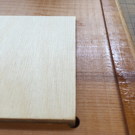
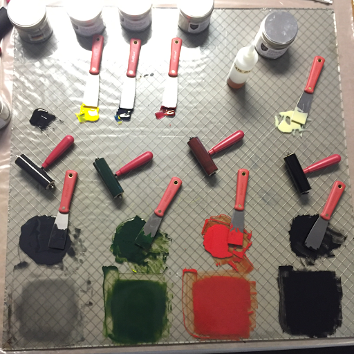
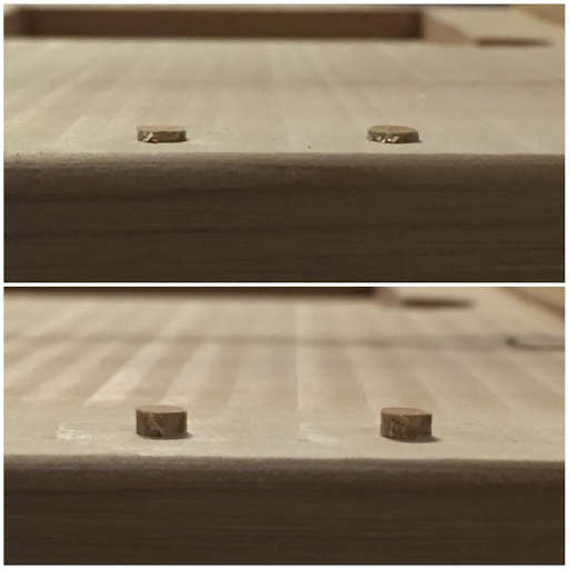
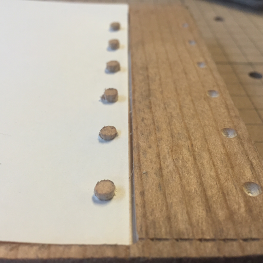
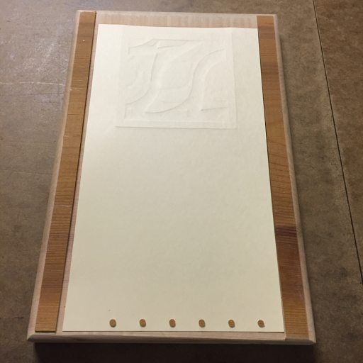
I woke up this morning excited to test my new registration jig. My hopes were crushed, however, when the first thing I did was to ruin the pegs on my first jig. I ran it through the press with a Masonite blanket (more on that later) and the pressure set too high. The press dutifully squeezed the pegs down and stretched them out so that the holes in the paper wouldn't fit over them at all.

[crushed pegs, new pegs]

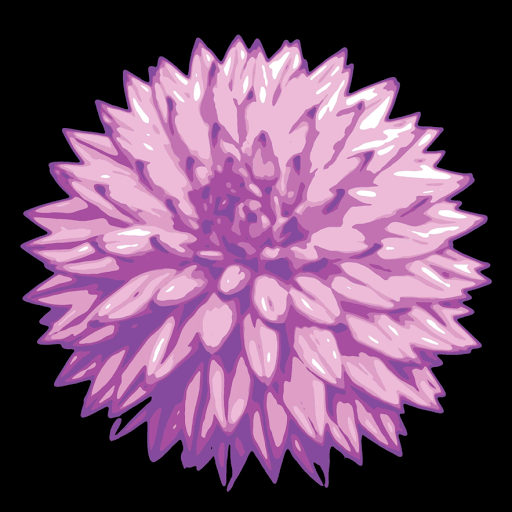
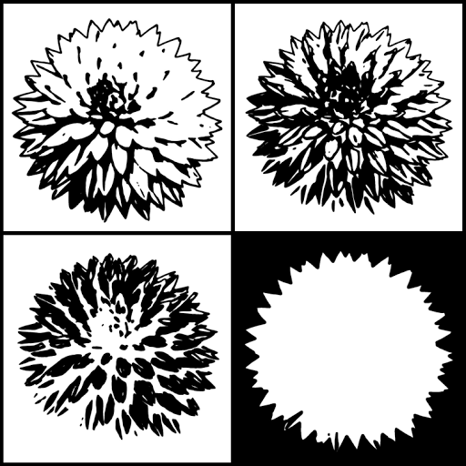
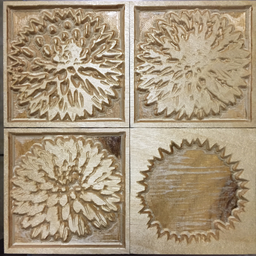
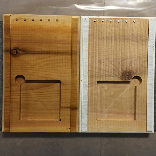
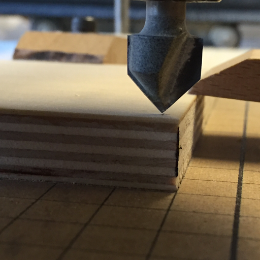
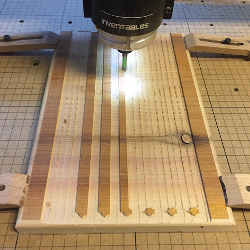
Thank goodness it was just a matter of carving another one. Since all I have to do is stand there and drink coffee with a vacuum in my hand while my robot assistant does the carving, I decided to snap a few pics of the process.

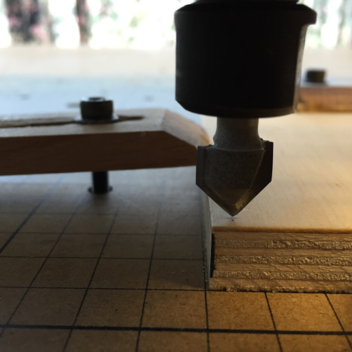
[carving the paper space with pegs, step 1]

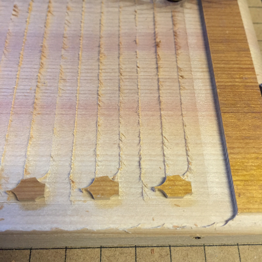
[carving the paper space with pegs, step 2]


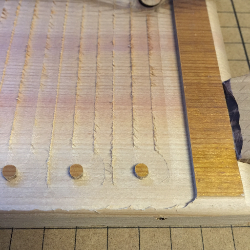
[carving the paper space with pegs, step 3]


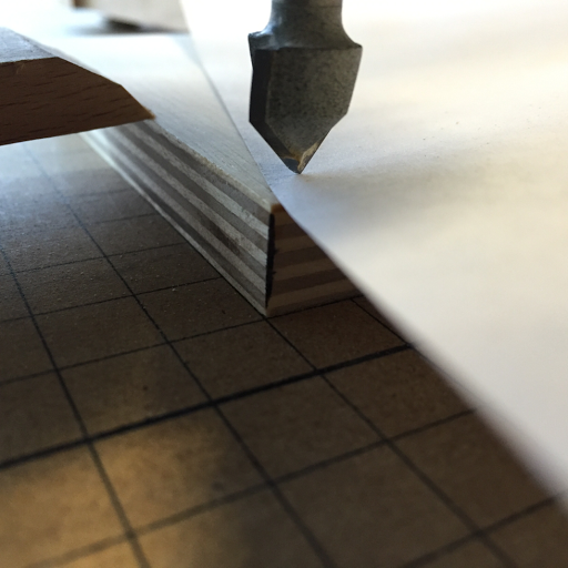
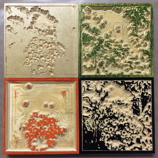
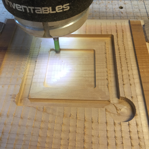
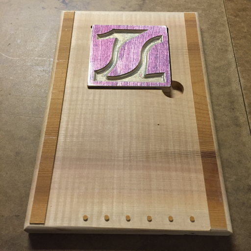
[carving the block space]

Once the new jig was carved, I sanded it and gave it a couple of coats of shellac before I tried it. If ink gets on the clean paper surface, I need to be able to clean it thoroughly and shellac provides the barrier to absorption that I need.

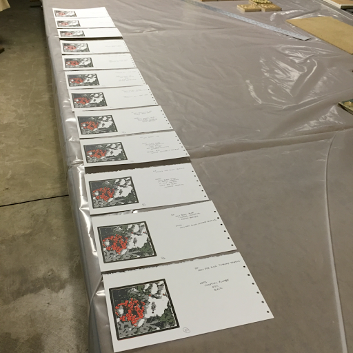
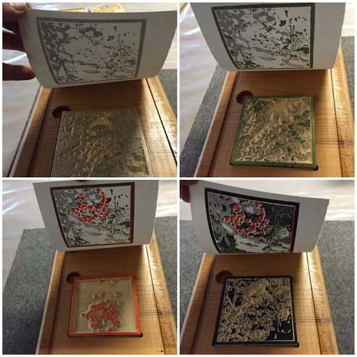
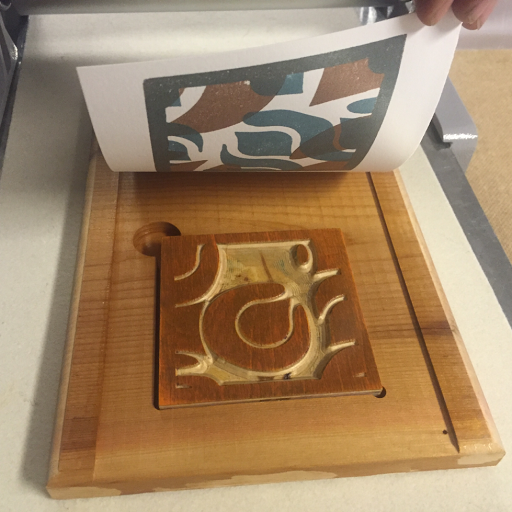
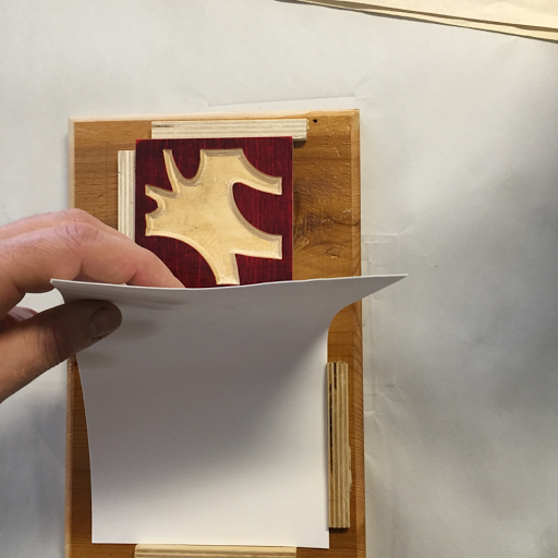
Right now I'm snapping the paper down onto the holes and leaving it there while I ink and place one block at a time against the far corner of the hole I carved for them.

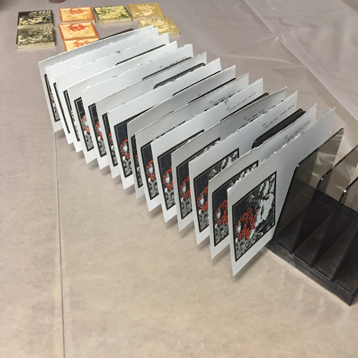
When I'm eventually pulling an edition, it will be the paper that gets removed after each impression. I'll print all of the prints with block #1, then change the block.

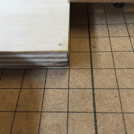
[ready to drop the paper for the third pass]

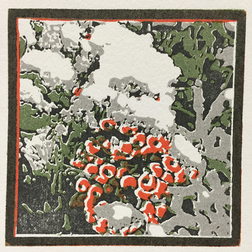
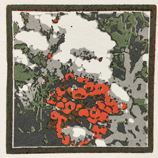
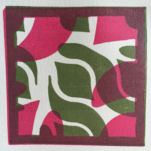
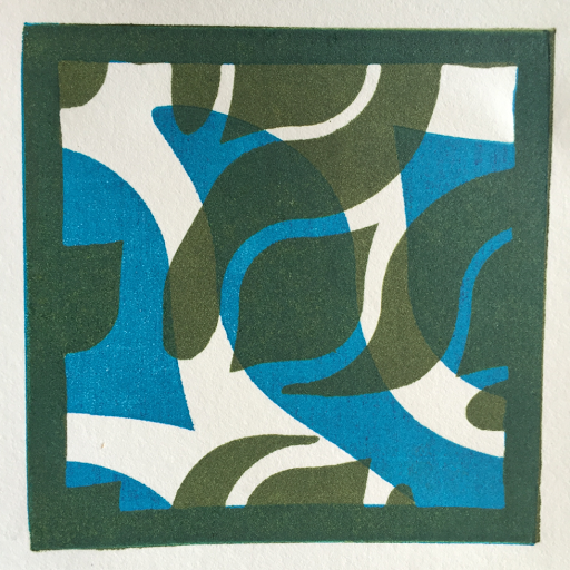
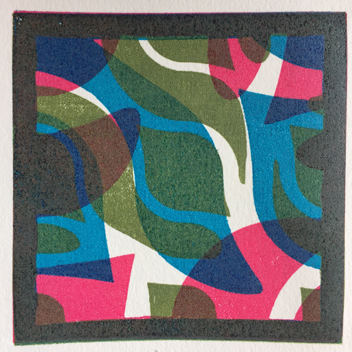
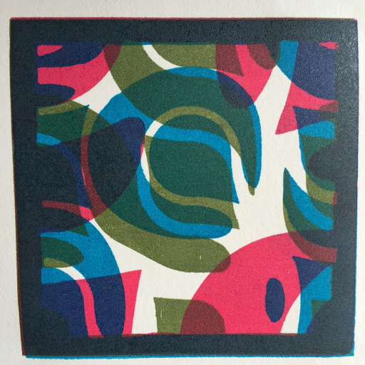
The registration is nearly perfect with this new system. I can pull impression after impression with tight control over exactly where the paper and the block end up. Inking consistency is another (big) issue, but the images end up where they belong.


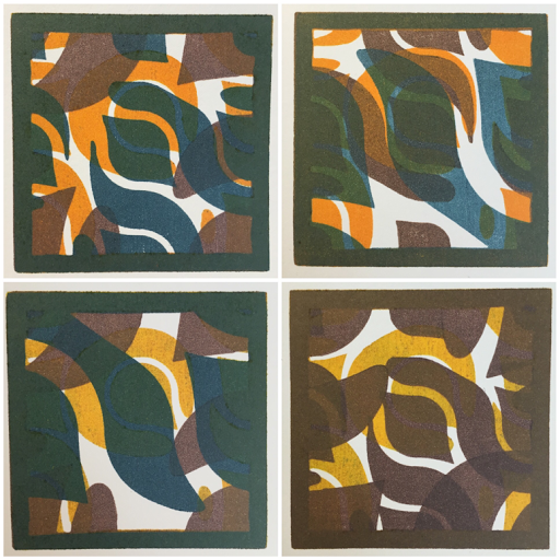
[nearly perfect block registration] 

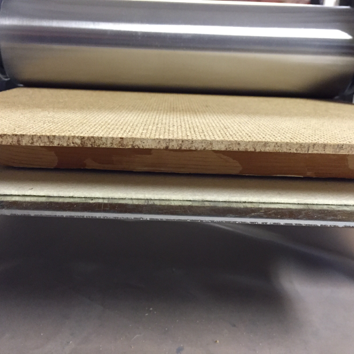
I've replaced the top press blanket with a Masonite board to give me solid, firm pressure against the surface of the wood block.

Thanks to Dune from Eugene Printmakers for giving me that tip. I would have just gone on thinking that my prints should be embossed or baffled as to how I could print without embossing if it hadn't been for Dune's kind advice.

[masonite, dry paper, wood block, jig, 1/16" catcher blanket, press bed]

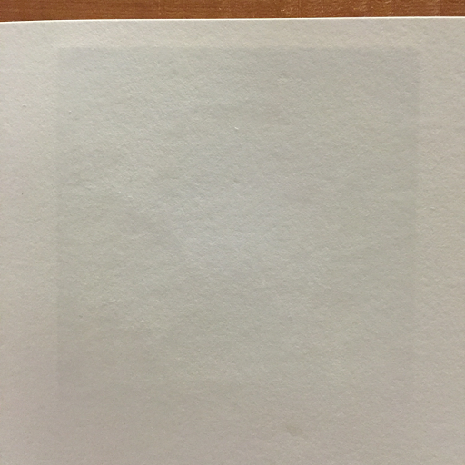
[back of a print with almost no embossing]

Friday, December 25, 2015

Filofax Punch Registration Jig

Today I started the process of developing a very accurate registration jig. It's based on a hole punch left over from the days before smart phones. I was obsessive about my Filofax organizer, printing my own custom pages and punching them to fit it.

The point of a registration system is to make sure that the paper and the printing block end up in exactly the same relationship to each other for multiple print passes. The previous system that I tried was reliant on the paper and the block being perfectly square. With 6 holes, the paper really can't shift. I will just need to ensure that the holes are straight and it will all be good.


[filofax hole punch]

This is an example of the sort of thing that makes me thankful for months of experience with the tools and techniques of CNC carving. I decided that, rather than lots of fiddling with a drill press and dowels, I can just carve exactly what I want from a single piece of wood. I just need to take careful measurements to translate from the physical punch to the theoretical design to the physically carved board. Here are a couple of tests. On the right you can see some carved holes to ensure that my circles lined up with the real punch holes. They did so I went on to the second test, carving away the background to make a set of pegs that line up with the punch holes.


[registration hole tests]

The next problem I ran into is that my paper cutter is off from square. Therefore, when I line up the punch to the bottom side, the edges are crooked.


[crooked paper]

The real answer is to upgrade my paper cutter since the one I have was salvaged from the trash and cannot be adjusted at all. For now, however, I can angle my paper to compensate for the crooked blade.


[compensating for out-of-square cutter]

After solving the problem of square paper, I was out of time for a real print test, but I couldn't help but run a test pass through the press and use the embossing to verify that everything was registered correctly.


[the whole jig]


[corner snugged into place]

It worked fine so tomorrow I can go ahead and run some tests with ink.


[jig with paper]

Notice how the original board isn't square? The pegs are nothing like a standard distance from the bottom edge. That's totally OK. The board was set so that the left and right edges were perfectly square to the cutting grid. All of the relationships between the components have to be correct because they were cut by the computer and not by the untrustworthy hand that had cut that off-square board to begin with.

Thursday, December 24, 2015

Baby Press Unboxing And Tests

Yay, I bought a press! Yes, it's a tiny one, called a "Baby Press". Laugh all you like. I promise to only press paper and inked things, no babies.

The arrival had me on pins and needles. Yesterday I received four separate packages. They contained the press bed and three blankets. The packages were marked 2/5, 3/5, 4/5, 5/5. Where was 1/5, the actual press?


[press bed and blankets]

It arrived today, bolted securely into its own sturdy crate. Well done!


[press, bolted into the crate]

It only took a few minutes to attach the feet, turn the height cranks around, and attach the big turning arm.


[all set up and ready to go]

Since it looks exactly like a larger press, here's a photo to give you a sense of scale. It's really quite tiny!


[a photo with the artist, for scale]

The first thing I did was to pull some prints. Boy, oh, boy! Every time I try something new I gain more appreciation for how many aspects of the printmaking were handled for us by the instructor of the class I took a few years back. She handled mixing the inks and setting up the press for the type of plates we were running each day of class. Well, I've got to learn to do all of that stuff myself if I'm going to be a printmaker!

Here are my first six prints, followed by descriptions of what went wrong with each one.

[first test prints]

  1. The paper moved in the press, smearing the ink. I didn't know how to handle the paper, the block, and the press at all. I think the pressure was too high, causing the plate to slide instead of feeding into the press.
  2. To keep the plate from sliding, I reduced the pressure. Too much. The block didn't make very good contact with the paper and the ink sure wasn't pressed into the fibers.
  3. The pressure is way better, but it looks like I over inked. The coverage is better, but the edges are smeary.
  4. I tried to hand register two impressions. The ink is so thick that the transparency isn't visible.
  5. Whoops! Over compensating. There is so little ink that there are marks from the brayer in the scant coating of ink.
  6. After a few misses, this multi-pass print turned out kind of OK. Yeah, the ink is a little thin so there are brayer marks. The transparency isn't very good and neither is the registration, but the pressure seems OK and the overall result is the best that I achieved in this first test.

[embossed back]

I gather from talking to other printmakers that embossing isn't necessarily sought after in woodblock prints, but I like it anyhow. Especially since just yesterday it was impossible for me to get embossing like this without soaking the paper.

Having a press, even a baby one like this, is going to make a huge difference in the types of prints that will be possible. I can see a path into the future where I use this press to print pieces to fund the acquisition of a larger press.

Wednesday, December 23, 2015

Registration Jig Results

This is a continuation of yesterday's post about building a jig to test a type of registration where the paper is lined up in one corner and the block is lined up in the opposite corner.


[block and paper in the jig]

I found some pretty serious requirements of this system. First, the blocks must be perfectly square. Mine are square on two corners while the other two are off. (I used the wrong tool to cut them.) Second, the paper also needs to be square. Third, the paper needs to be laid down exactly the same way each time. The change in height between the block and the bottom edge of the paper adds a significant amount of play in the vertical aspect of the registration.
Those things said, here are the actual results from the test...


[unsquare block corners and unsquare paper]


[two passes laid down differently, probably because of height difference]

I have a lot to learn about the theory and the reality of ink viscosity. The following image doesn't show it very well, but the third pass with the green ink pulled up the wet ink from previous passes instead of covering it with green. I think that the green was more viscous and that it pulled up areas of the less viscous cyan and magenta.

After I learn the theory, I then need to learn how to mix inks of differing viscosities and how to determine the viscosity of a pool of ink on the slab.


[something funny happened with the ink]


[again, the height difference led to bad vertical registration]

This last image was the most successful, but sort of a fluke since the height of the block really throws a spanner into the works of vertical registration. The next system that I try will need to lift the paper up to the height of the surface of the printing block.