Saturday, April 30, 2016

Uninspired Days And Production

There are days when the muse is silent. I have no inspired ideas, no "next steps" on a current project. I'm sleepy and don't want to do anything.

Well, as a self-employed artist, "doing nothing" is not an option. Thank goodness that there's always "production". I'm still recovering from a sleepless night a couple of days ago and the creative juices just aren't flowing yet.

 
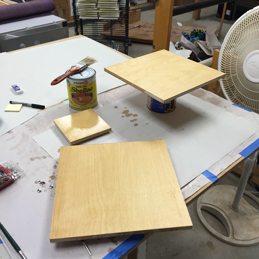
[Shellacking Plates]

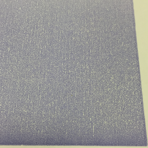
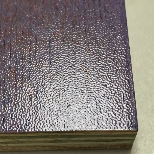
I know how it works, though. A lull like this is often followed by an "A-ha!" day. On that day, I'll have an idea that will send me into a frenzy of ink mixing and printing. On that day, I'll wish that I had a stack of plates shellacked, carved, and ready to use. It takes about a day to shellac, dry, sand, shellac, dry, sand, cut apart the plates so that they're ready to carve. After carving, it takes another day to shellac, dry, and sand the finished plates before they can take the ink and the pressure of the press.

 
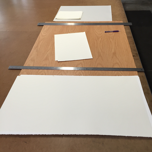
[Tearing paper]

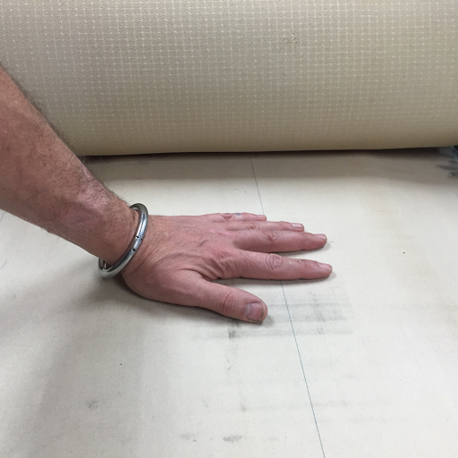
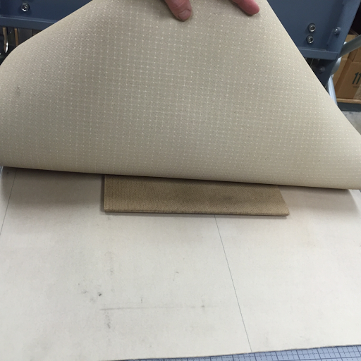
The other thing I can do while I wait for the first coat of shellac to dry enough for sanding is to tear down paper to the size that I'm currently using. On the day I'm fired up to pull prints, I really want to just open a drawer and pull out a stack of paper, all ready to print.

 
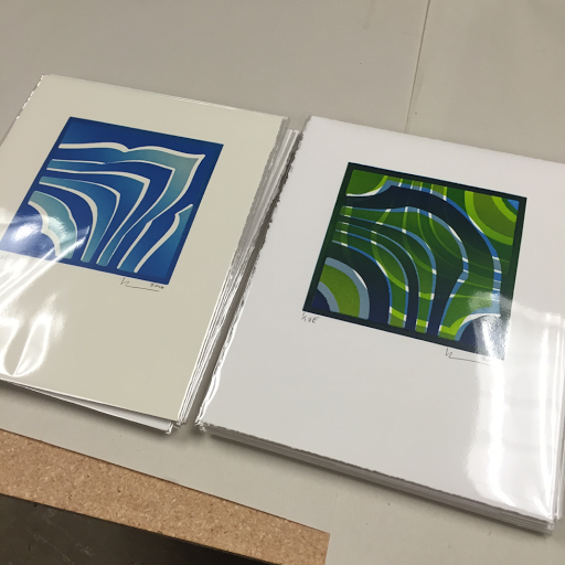
[Packaged prints]

The last thing that I can do is to sign and package prints that are ready to go into my sales inventory. This is one of the biggest differences between hobby art and business art. Hobby art is done as soon as it is dry. I could tack it to the wall, give it to a friend, or just slide it into a portfolio. In preparing for sales, the print isn't done until it's signed, numbered, and packaged with the certificate that makes it valuable to a customer. (There are artists who say that the print isn't done until it's sold. I guess I'm generous.)

So, yeah, even on days when I'm exhausted and utterly uninspired to do anything, there is stuff that I can do to move myself slowly but steadily toward the goal of owning and running a printmaking business.

Friday, April 29, 2016

Getting Ready For Web Sales

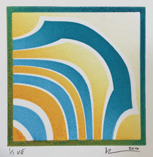
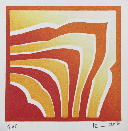
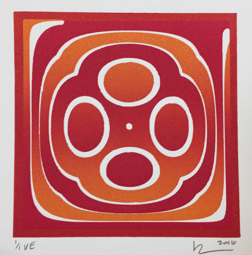
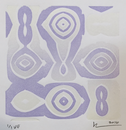
Yesterday I launched my first printmaking web sale. Here are some snapshots from the day that it took me to prepare for it.

First, I had to spend an hour signing prints and getting them quickly into cellophane for protection. Every minute that a print spends loose in the studio is a chance for something to damage it - ink, coffee, finger grease, etc.

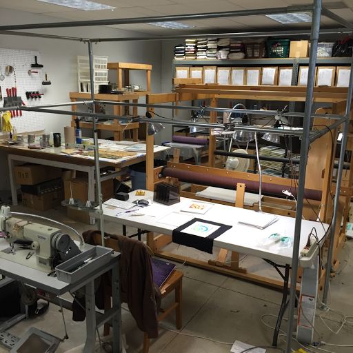
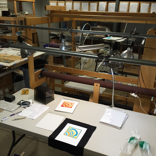
Once they were safe I had to shoot photos of the chosen dozen. You can see that space is a little tight for such a large setup, but it's the easiest way I could come up with to hold so many light fixtures. The pipe rig barely squeezes between the sewing machine and the (currently empty) loom.

[Lighting rig in situ]

Smooth, even, bright lighting is crucial to photographing flat media. With four fixtures suspended just two feet above the prints, it was very bright.

[Lighting setup]

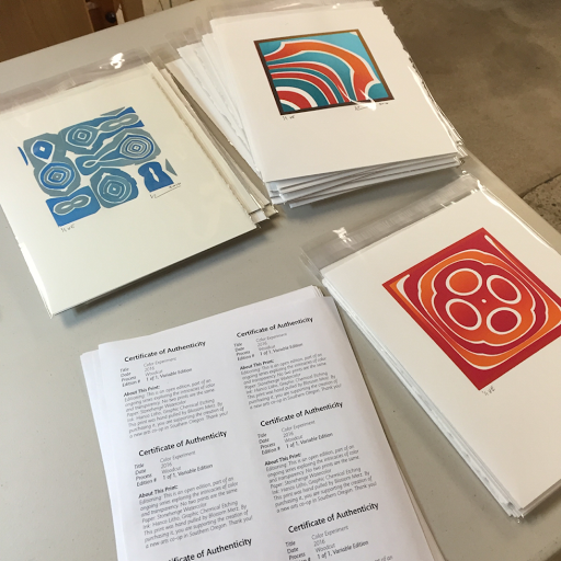
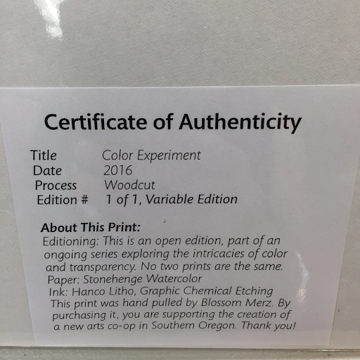
Then I had to design, print, cut, and insert the Certificate of Authenticity before sealing the envelope.

[Prints and Certificates]

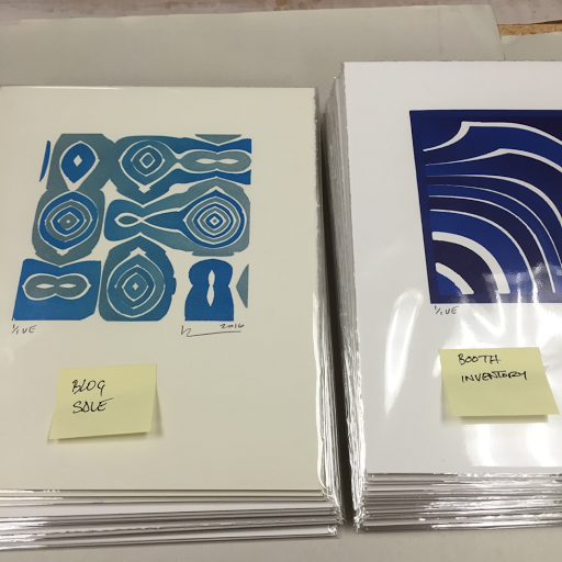
At the end of the day I had two very satisfying stacks of prints, twelve to sell online and even more to put directly into my booth inventory. It's my goal to do this process once a week to get my web store full of interesting work and keep the cost of my materials covered. I won't really make any profit until I'm selling in higher volumes and experienced enough to charge higher prices, but covering my ongoing costs is the first step!

I sold 5 of the 12 on my first day. Thanks, y'all! If your favorite has already sold, keep an eye on this space. I'll soon being hosting a variety of sales and publishing them a little earlier than I did with this one. This series of work is all original so I won't duplicate a color scheme, but I'm sure that you'll see something that you like in one of my future sales.

[Two stacks of prints]


Thursday, April 28, 2016

Woodblock Print Intro Sale, $10

Update: This blog sale is over. Any prints that are left have gone up slightly in price and been offered to the public in my Etsy store: blossommerz.

Subscribe to my blog or my Instagram feed and be the first to find out about my next blog sale. I offer my new work to blog readers first and most affordably.

At last, the time has come for a series I've been waiting to post to the blog. It's called "What's new and ready for sale?" It'll be a chance for me to offer my print work to my blog readers before it goes to the general market.

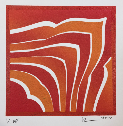
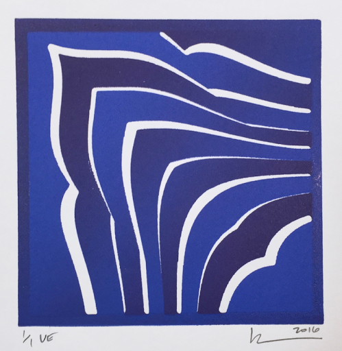
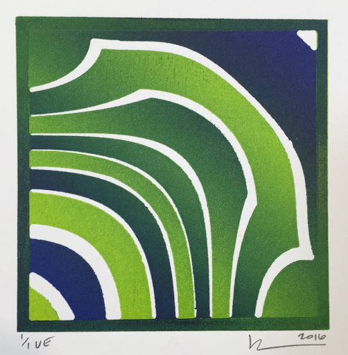
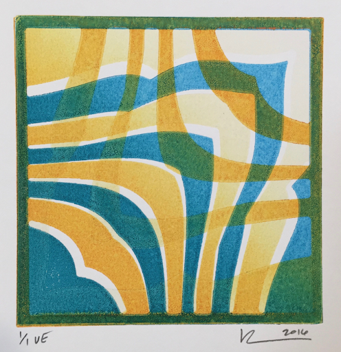
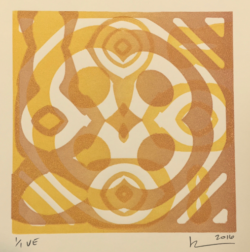
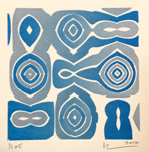
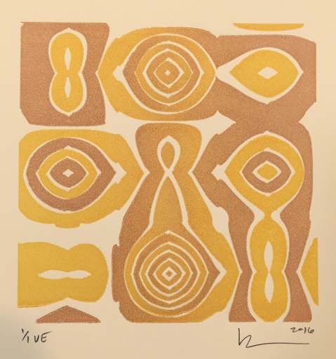
A few months ago I decided that I can't afford to just pull test prints forever without having some way to cover my expenses. Paper and ink are expensive, say nothing of studio overhead and, drumroll, please... my time. So instead of pulling diagnostic overlapping circles to learn my color lessons, I switched to geometry that I find interesting.

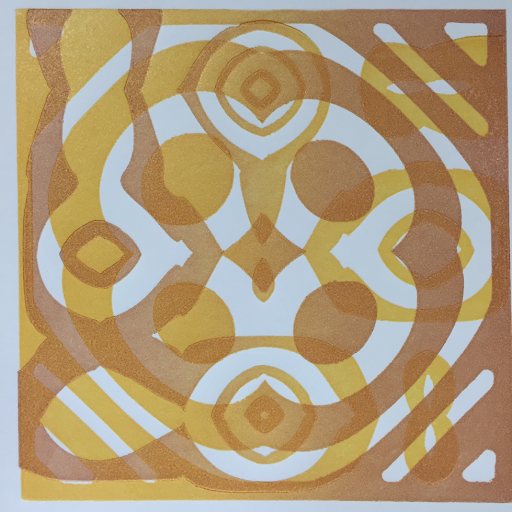
I've been working in an 8x10 format for a few weeks now. Each piece is a unique set of colors, hand printed on archival watercolor paper, signed, and backed with matte board. It includes a certificate of authenticity, and will arrive sealed in a cellophane envelope.


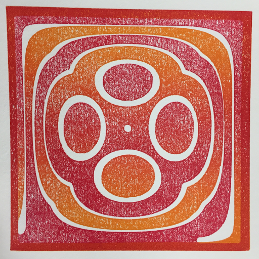
[5x5 blocks on 8x10 paper]


[Certificate of Authenticity]

The way I'll structure these posts will be to show the best dozen prints on my blog periodically. These will be available for mail order - first come, first served. Prints after the best dozen will only be available in person.

Additionally, if you see an image go across my Instagram feed, speak up and you can get it as soon as the ink is dry.

I'm starting the 8x10 prints at $10. If you need them shipped, I'll just charge you what it costs for supplies and postage, $5 per padded envelope, which can include multiple pieces. All of my prices will, of course, increase as I become more experienced and my work becomes better and more sought after.

I'll update this page to mark them sold as fast as I can, but there is a slight chance that I'm not fast enough. Any that are left after a week will go into my show inventory or my Etsy store.

Please remember that these pieces are so affordable because they are student work. Some of the ink is too light. Some of it is way too heavy. Sometimes the registration is off. Sometimes a dark color of ink got trapped in the wood grain and squeezed out into lighter prints. These are the kinds of mistakes that I won't make when I become more experienced, so these early pieces might just end up being the ones that collectors want.

And, please remember that computer colors are never a good representation of the colors in the real inked print. While they look perfect on my screen, your screen may show the colors very differently from the actual print.


[#1 - MOVED TO ETSY]


[#2 - SOLD]


[#3 - SOLD]


[#4 - SOLD]


[#5 - MOVED TO ETSY]


[#6 - MOVED TO ETSY]


[#7 - MOVED TO ETSY]


[#8 - MOVED TO ETSY]


[#9 - SOLD]


[#10, warm white paper - SOLD]


[#11, warm white paper - SOLD]


[#12, warm white paper - SOLD]

To place an order, simply comment on this blog post or email me and tell me what number you want.


Wednesday, April 27, 2016

Borderless blocks and pressure-evening rails

Yesterday I was confronted with an issue related to printing with borderless blocks. The pressure was applied unevenly to the plates because there was no border to keep it even. Then I realized that I could add block-high supports on either side of the paper to take up the excess pressure.

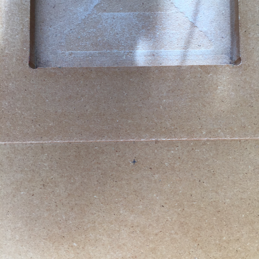
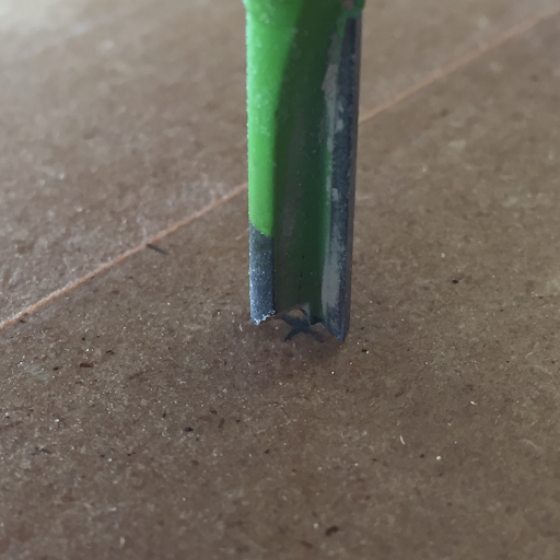
This is another case where I am very glad to have invested in the CNC router and the time to learn how to use it well. It makes the creation of precision wooden tools relatively easy. There is a certain complexity to it, though. To carve on an existing piece, I needed to create a point that I could locate exactly in the computer. I chose a point 1/2" down from the center of the paper recess.

[The new center]

[Bit on center]

Once the slots were cut, I grabbed some pieces left over from cutting down plates and sized them for the rail slots. They are exactly the same height and composition as the plates and the slots are cut exactly as deep as the recess that holds the plate.

[New rail slots and rails]

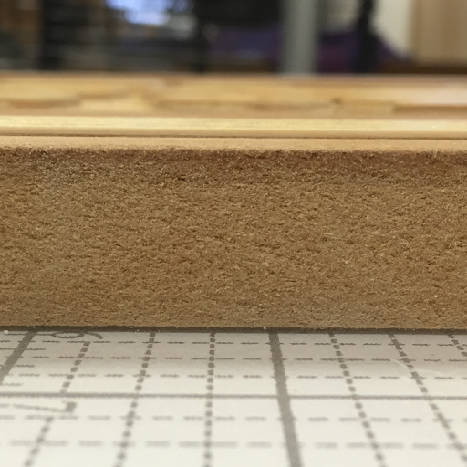
Rail height, just enough to consistently receive the pressure.

[Rail height]

The results are beautiful. The pressure looks consistent, even on the new, complex plate with no borders.

[Nice pressure!]

In this image, you can also see that I am designing the geometry plates to be used together for varied and interesting effects. I'm designing and carving two or three new block designs each week so soon I'll have a large palette of shapes to choose from while I continue to experiment with color techniques.

Tuesday, April 26, 2016

Borderless blocks, first test

In an effort to keep expanding the horizons of possibility in printmaking, I'm testing the waters of a new skill - printing blocks without solid borders around the edge. This is another basic, foundational skill. When I remove the requirement to have a solid border, there are many more design possibilities available to me.

There are some of the reasons why I put borders on my blocks in the first place:
  1. I need a solid edge to clamp down the pieces on the router table.
  2. Solid edges help in rolling out the ink.
  3. Solid edges ensure even pressure across the block on the press.
And here are some reasons to remove them:
  1. In multi-layer prints, ink builds up quickly if every layer has a border.
  2. Borderless blocks can be cut into pieces to be inked separately and assembled on the press
  3. and, of course, I can use the lack of a border as a design element.

Here's the process of removing the borders...

First, I cut my blank blocks with a little extra space for the clamps on the router table. A 5" block is actually 5 1/4", leaving 1/8" on each edge for the clamps.


[Clamped edge]

After carving, there is a solid border, but since my measurements are careful, I know exactly how much space is left on the edges.

[Geometry block freshly carved]

Then I go to the table saw. Yes, I have the anti-kickback mechanism and blade guard removed. (Trust me, I'm careful. I know that it's much easier to master a new craft with all of my fingers attached.) I've also gone to great lengths to ensure that the blade and fence are absolutely, perfectly parallel. With a careful width setting on the fence, I slice off the edges, ensuring that the blocks are oriented the same way so that any minuscule error shows up on both blocks, keeping them in register with each other when it comes time to print.

[Carefully slicing off the edges]

Since there was only 1/8" of extra space on the edges, I couldn't drive the router into the border and had to remove the outside bevelled edge by hand. One day, I'll be doing a lot of hand carving on the plates, so this is just a taste of things to come.

[Trimming off the leftover bevels]

[All trimmed!]

After trimming and cleanup, it was time to add one more layer of shellac. This seals the bevels and the low-lying areas of the plate against ink absorption.

[One more coat of shellac]

If you've been following along, you know that the following image represents two substantial milestones, successful ink transparency and borderless carving. (The lavender is not mixed with white - it's very transparent.)

[two firsts]

I did pretty well at rolling out the ink without a border to depend on. It just takes concentration and a steady hand, but I'll probably eventually build an inking jig so that I can ink irregular blocks faster and more accurately.

The pressure is another matter. If you look closely at the top and bottom of the image, you'll notice that the blocks are digging into the paper. This is because the total pressure of the roller is concentrated in a smaller area, leading to extra pressure per inch.

Concentrating pressure like that will quickly compress parts of the blocks, causing them to wear out after just a few impressions. This is a real problem and one that I'll need to solve before I can make heavy use of the borderless printing technique.

Monday, April 25, 2016

Impatience and Earning Chops

Experience. I know from other crafts that I've learned that it's irreplaceable. And still, I want to learn at warp speed. I wish that every new skill that I try would just jump up and greet me, "Oh, hi! I wondered when you'd get here!"

But alas, it isn't like that. Every day I try to experiment with a tiny variant on an existing skill, pushing slowly and steadily in the direction of my big goals. But every new skill takes three or four days instead. I wring my hands, google for expert answers, and try everything I can to get the new thing to work. Sometimes I walk away defeated (for now!) and try another new skill instead.

I have what, in my naiveté, seemed like a pretty approachable set of goals, but the more I learn the more there is to learn.

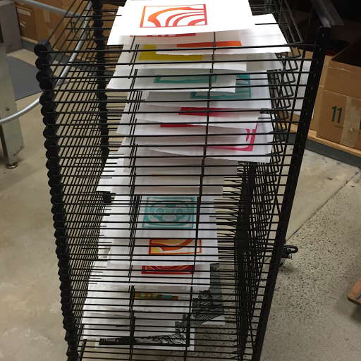
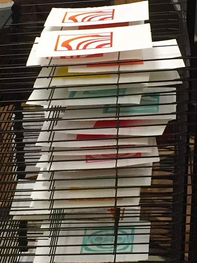
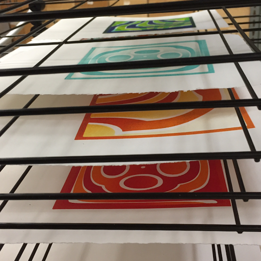
[Three days of mostly failed prints]

[Top of the rack has the first layer of a multi-layer print]

[Bottom of the rack is finished work]

I know I'll get where I want to go, mostly because I'm stubborn as heck! The more difficult the task, the fewer the people who will have mastered it. If I just keep at it, eventually I'll be doing things that nobody else has done. I know that it will probably take many years, but I really believe that some day other printmakers will look at what I'm doing and ask themselves, "How is that even possible!?" But I've got an awful lot of failure to endure before I get there.

Master-befuddling skill level isn't even my goal. I'll write a blog post sometime soon and show you the work of folks who inspire me to keep pushing my skills to produce the art that I have in my head.

Sunday, April 24, 2016

Better Pressure

(Those of you who are paying attention will notice that posts are showing up out of order. Yesterday's post on ink transparency got bumped up so I could send it to printmaker friends and ask for help...)

Two steps forward, one step back! That seems to be the theme for my printmaking work right now.

I really don't know what has changed since I was pulling decent prints last week, but something has. Suddenly I cannot get the roller up and onto the plate if there's enough pressure to give me a good image. It may be that the new jig is slightly shallower than the old one, making the block lip slightly higher? I just don't know, but I'm impatient to continue with my color experiments and don't want to waste a lot of time figuring it out.

[Bad pressure before]

[Good pressure afterward]

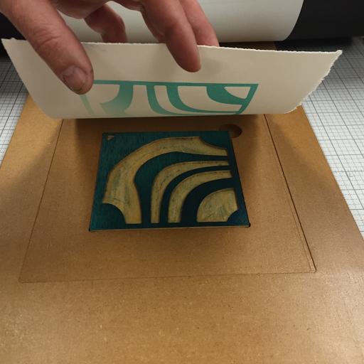
Here is a synopsis of how the layers are set up now. First, the inked block, then the paper. Behind that you can see the newsprint that protects the rubber offset blanket from ink and vice versa.

[Block and paper]

Then comes the hard rubber offset press blanket. This gives a firm, but slightly resilient surface, resulting in a very slight and controllable embossing.

[Hard rubber offset press blanket]

To get the rollers up onto the plate, I'm using a ramp of masonite. To get the rollers onto the masonite, I'm cushioning the edge with the thick rubber blanket that comes with the Whelan press.

[Masonite and thick rubber blanket]

With just the thick rubber blanket and no masonite, there was too much pressure being applied to the hard rubber blanket, resulting in too much embossing.

So, yeah, it's a lot of fiddling to get the layers in place for each print, but at least I'm not dead in the water while I carve yet another jig.

Friday, April 22, 2016

Spotty ink coverage

(For this post, I'll keep chronicling the things I try until, one fine day, I have a solution.)

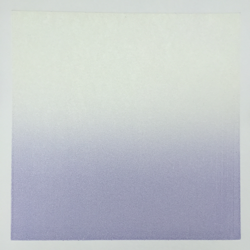
It's really quite clear to me that I'm still a beginner, even after four months of trial-and-error experience. Today I'm wrestling with getting good ink coverage from very transparent inks. Here's a distance shot to show you what I'm going for - very transparent ink.

[Transparent ink]

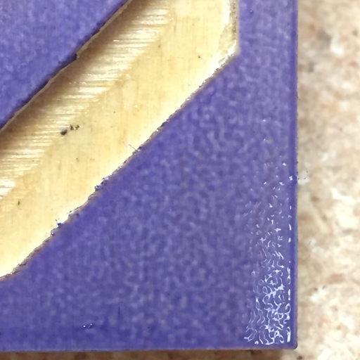
When you get up close you can see the problem. There are lots of little gaps in the ink. This is usually the case for my first impression with a dry plate. After going through the press, though, the plate has accepted the ink everywhere and prints well. Not this time. It's a little tough to see, but the ink is standing up and creating an effect like mezzotint dots. It's consistent, but not what I'm going for.

[Tiny dots of ink]

I decided to ink a little heavier, still building up one very thin layer at a time. The problem became apparent when I looked at the plate from an angle.

[Orange peel ink texture]

Looking straight on, you can see the problem that uneven ink distribution is causing - uneven pigment distribution.

[Uneven pigment distribution]

And the result is quite predictable - uneven pigment distribution onto the paper. Even with heavy inking, it never smooths out and becomes an even film of ink.
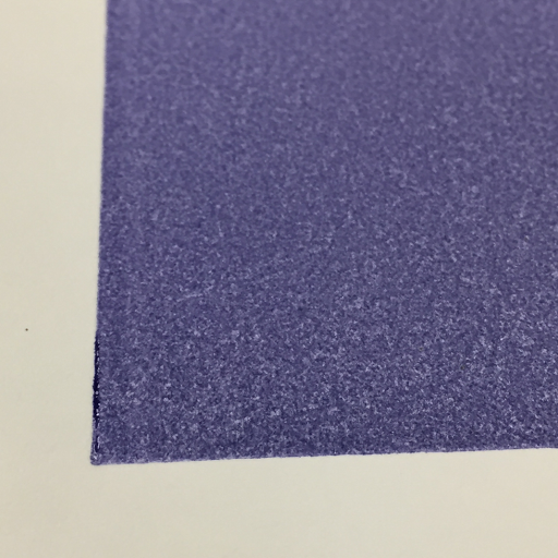
[Uneven print]

The problem doesn't start with the plate, though. It begins with the ink on the slab. Then it's transferred to the brayer, and finally to the print.
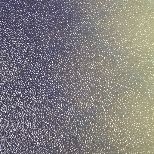

[The problem begins on the slab]

I beat my head against this problem for a few hours on the first day. I ruled out the brayer by testing three different hardnesses and materials. I cleaned the ink slab a few times with different methods to rule out contamination by soap, oil or solvent.

I tried adding plate oil (burnt plate oil #2) in an attempt to improve the flow of the ink.

Then I hung it up for the night, taking to the internet for solutions. It seems that there are a few things to try tomorrow:
  1. Plate Oil #000
  2. Tack Reducer
  3. Vaseline
  4. Odorless mineral spirits, after making sure they won't harm the brayer.
  5. A stretch... Make transparent base from only chalk and plate oil.


Day 2:

I tried all of the options that I had identified yesterday, cleaning everything carefully between each experiment. They all ended in exactly the same results, except the vaseline. I added more and more until, finally, the paper just slipped off the plate instead of advancing the press. While not ideal, it was certainly the most "interesting" result. Everything else ended exactly the same way, with some variation of orange peel texture and uneven printing.

If I'm going to solve this problem, there's nothing left to do but scour the internet for more options. Maybe if I look for candid shots of the studios of artists using transparent color techniques, I can glean some vital clue as to how they're doing it...


Day 3:

Lots of googling and photo studying later, it seems like the folks who are using transparency in the way I want to are thinning their ink to a very runny consistency and inking lightly. I mean, yeah, it kind of makes sense. Dense, thick ink is used to make dense, thick color, which is usually the goal.

(Tried it, failed.)

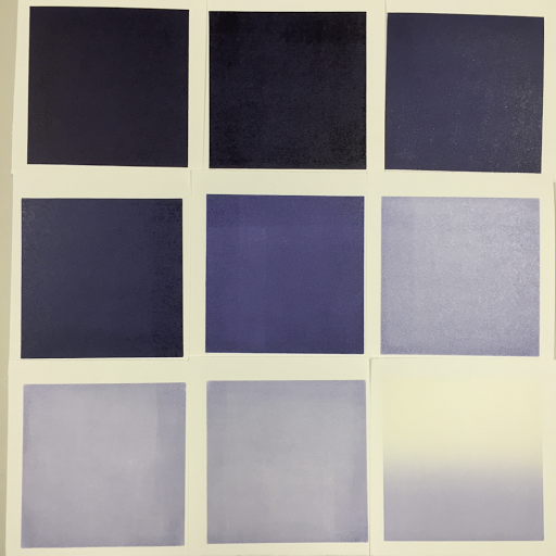
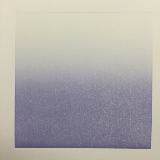
Ta-Dah! I finally found the answer. I started with an ink that I know to cover well, the custom purple that I blended from Graphic Chemical etching inks with no modifiers. Then I added a little bit of transparent etching base at a time. At a certain point I noticed that the ink felt loose and started covering poorly. A-ha! It's too loose! I know the solution to this - magnesium carbonate. I mixed it in until the ink felt like it had when it was printing well. And just like magic, it started behaving just like I wanted it to, laying down a thin, but perfectly even layer of ink. For the last three tests, I was just perfecting the consistency and rolling out the thinnest layer possible. You'll notice that there are inking inconsistencies which become more and more visible as the transparency increases. I got tired of cleaning the large brayer every 10 minutes all day so I switched to a small one that can't cover the plate. For even coverage in real prints, I'll use the right brayer.


[mixing mag]
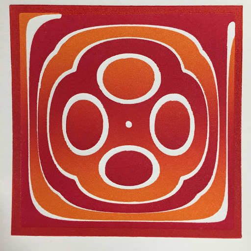

[from known ink to high transparency]

I'm very happy with these results. For the rest of the day, I'll finally get to print the smooth gradients that I wanted to do a few days ago. Lesson learned!


[final exam for this lesson]